Web Design
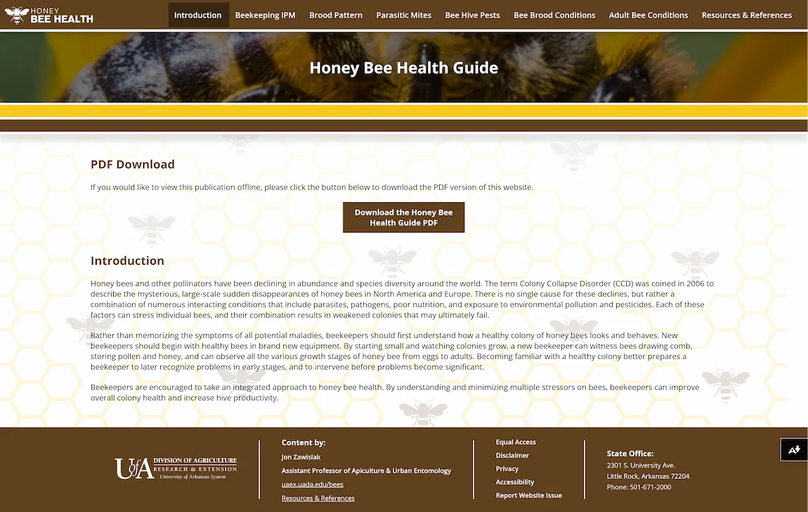
BackHoney Bee Health Guide
I created this website during my time at UADA as a Professional Assistant I. Before beginning the wireframe work for this site, I met with stakeholders to discuss their needs. This site was to be a companion to the existing PDF version of the Honey Bee Health Guide and needed to follow similar branding to feel cohesive. Since this site was going to be used in the field, it was mandatory to be mobile-friendly and would have to follow WCAG accessibility guidelines to be ADA compliant. I went to work wireframing in Adobe XD picking colors directly from the PDF to maintain a similar brand and grouping information in a way that makes sense in a website format.
I’m most proud of how I configured the navigation as it is entirely accessible by keyboard, even in the mobile state. Taking the table of contents of the PDF and adapting it to the navigation proved useful as it allowed users to go directly to the section they were interested in without having to use search features and type in exact wording. Each section contains an anchor tag that allows for bookmarking or sharing directly to that section as well. In addition to keyboard accessibility, all colors were checked for visual accessibility, and the site was tested for screen reader access.
This was a project where I got to flex not only my design skills but my skills in semantic HTML as it was a requirement to ensure that this website would be fully accessible to as many people as possible. I worked diligently to make sure that every image would have alt text and appropriate attribution, that font sizes were large enough and distinguished from any background elements, and that any interactive elements were accessible by keyboard and had appropriate focus styles applied. All of this work paid off, and the site still scores a 100 in accessibility in Google Chrome’s Lighthouse tool.
Here is a link to the production page. Below you can view a screenshot of the landing page:
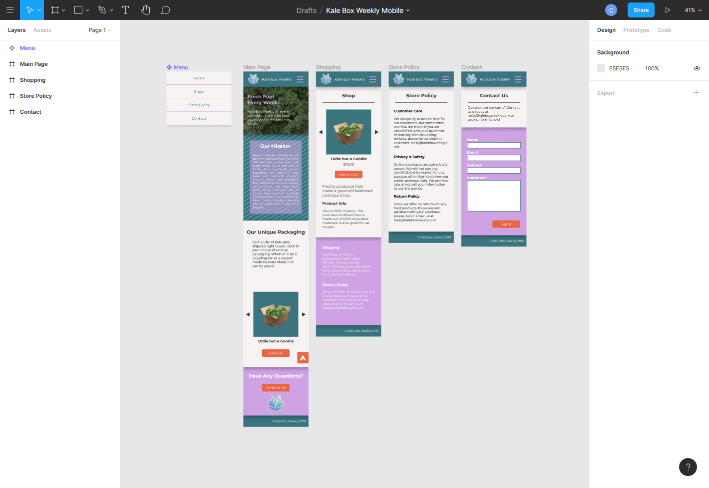
Kale Box Weekly
This project was part of Thomas Wallace's Mobile Web course at UA Little Rock. In this course, Thomas taught us how to design websites utilizing Mobile First coding practices. In the modern web mobile interfaces are important to accommodate. Styling for these smaller devices first saves a lot of time and troubleshooting when expanding styles to desktop sizes.
For this particular project, Thomas had us come up with a business and design a website for it utilizing the Mobile First approach. Here is a link to the finished Figma Wireframe. Below you can view the full spread of pages:
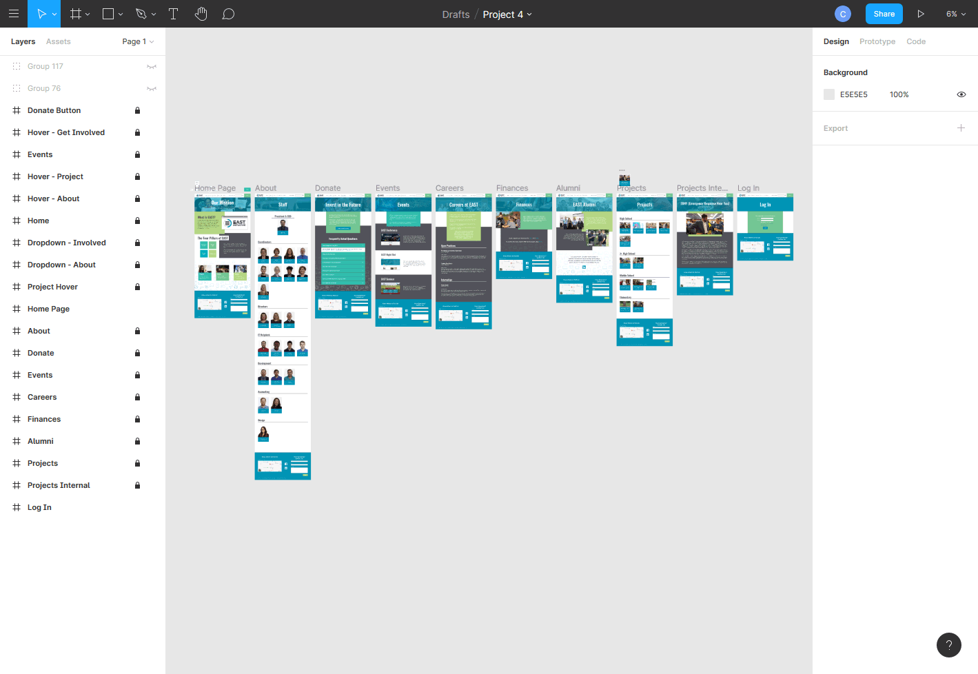
EAST Initiative Website Redesign
I created this wireframe for Kevin Cate's "Web Design" class. This course was taught with a focus on the Graphic Designing element of building websites. We explored how to place content in a way that was eye catching and simultaneously easily usable.
For this specific project, we were tasked with redesigning the entire website of an existing non-profit business. I chose to redesign eastinitiative.org. I tried to keep the original intention of the design while modifying elements such as the color palette and the layout for a fresh look.
Here is the link to the Figma Wireframe. Below you can view the full spread of pages: