Graphic Design
BackStudent-led Rare Disease Interest Group (RDIG)
I was approached by a student-member of a local hospital’s Rare Disease Interest group. This group was in need of a pin to give to patient and physician speakers as a token of appreciation. The client had an idea to use the rare disease awareness ribbon in this design, but needed someone to bring it to its final form.
There were a few requirements for this pin:
- It had to be no larger than .75 inches in diameter
- It had to contain 4 colors or less
- The awareness ribbon must be present
- The text “RDIG” must be present
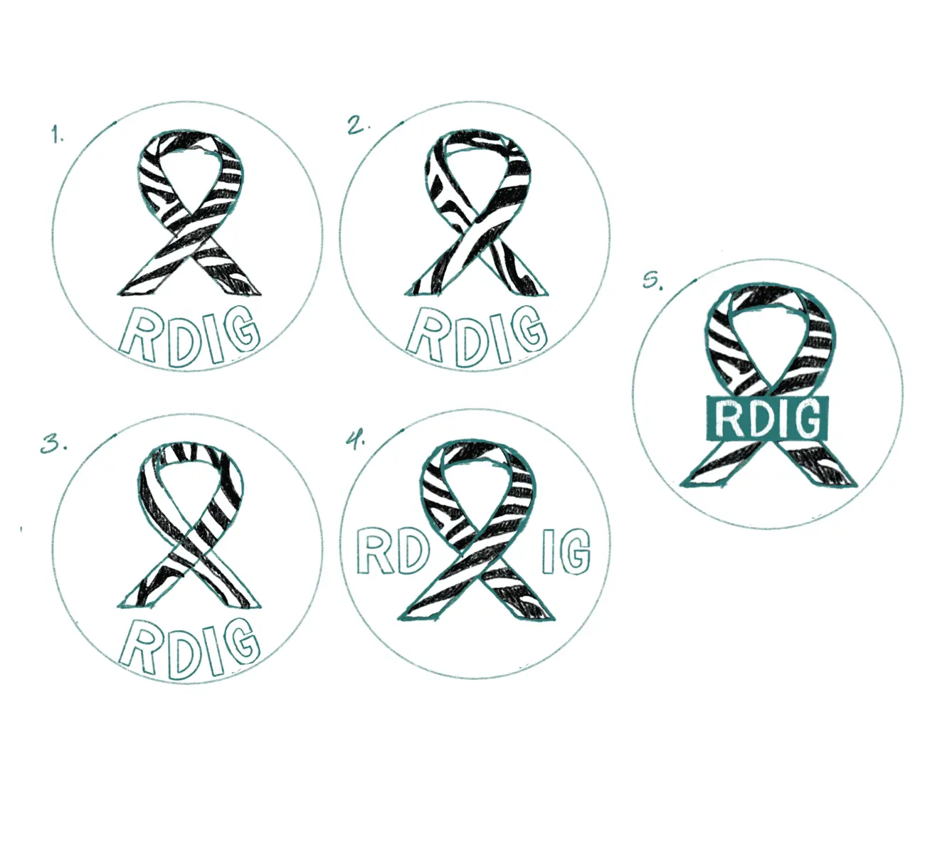
After discussing these requirements, I got to work producing some sketches to show possible layouts. I created these sketches using procreate illustrating different zebra prints and different text placements. Once finished I sent the client the sketches for another discussion where he ultimately chose sketch number five.

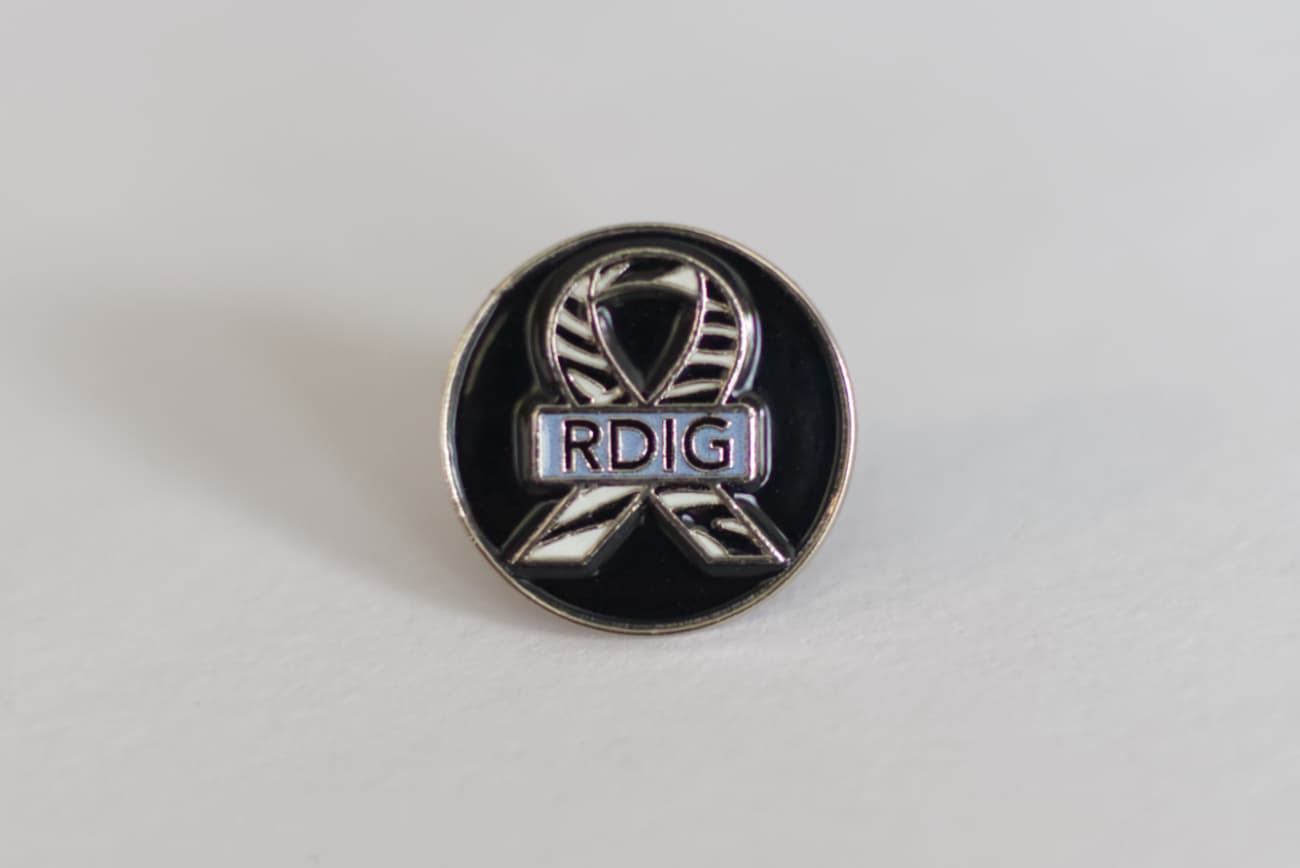
With the design chosen, I started work building out the vector version of this sketch. For my mockup I used a gradient to represent the metallic material of the soft enamel pin to better represent what the final product would look like. I chose a simple blue color for the text block background – similar to ceil blue commonly used in the scrubs physicians wear – and sent several background options to choose from.
Once the mockup was finished with tweaks to color and shapes, I prepared the design for printing. I took the initial RGB design and converted it to CMYK to prepare the colors and then changed the gradient to a bright pink to clearly show which part of the design was meant for the metallic material. I modified the vector shapes to split them apart so that no piece of the design was overlapping with any other and converted the text to curves to ensure that it would be retained during any printing preparations.
I sent the finalized SVG to my client with a note to pass onto the printers, and the pins printed successfully. I was fortunate to be gifted one of the pins as it’s always rewarding to see projects worked digitally come to life in a physical medium. I was happy to have an opportunity to apply my graphic design skills and help out a local student-led group.

The proceeding works were created as part of the Intro to Graphic Design course at UA Little Rock, taught by Kevin Cates.
Logo Design | Catfeine Palace
The first project we were tasked with completing upon the start of the Intro to Graphic Design course, was to create a logo for a fake business. We were limited to using only three colors, and had to design this logo based on the features of an animal of our choosing.
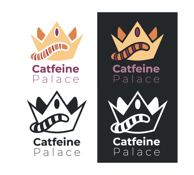
I chose to create my logo around a Cat-Cafe business named "Catfeine Palace". This type of business houses cats for adoption. Patrons can come inside and grab coffee while helping socialize cats so that they are ready to be placed in their forever homes.
Below is my submitted work. I provided four different versions to show the versatility of the logo for minimal color options as well as applications on light and dark backgrounds.

Magazine Design | Big Sister
This project was actually divided into two separate projects. In the first part, we were tasked with designing a magazine cover around a concept of our choosing. We had to make sure that our designs reflected real-life covers. It had to include dates, editions, price, and the UPC-A barcode - basically it had to look shelf ready.
I chose to make my magazine primarily focus on women's issues and interests. Instead of going for a generic "femme" look, though, I wanted to make the look and feel more dystopian. I did this by naming the magazine itself "Big Sister" in reference to George Orwell's novel, 1984. The images and colors I chose also reflect this aesthetic by having a more 'industrial' feel.
In the second part of this project, we were tasked with creating a two page spread that would match the theme of our magazine cover. As a reference to the article on the top left of the magazine cover, I designed my spread to feature a small article about Abortion rights in the US and how each state is handling them. I included an excerpt from a real article to fill up the page with real text.
Below you can see both of these submissions:


