Intro to Graphic Design
Taught by Kevin Cates
Logo Design Project
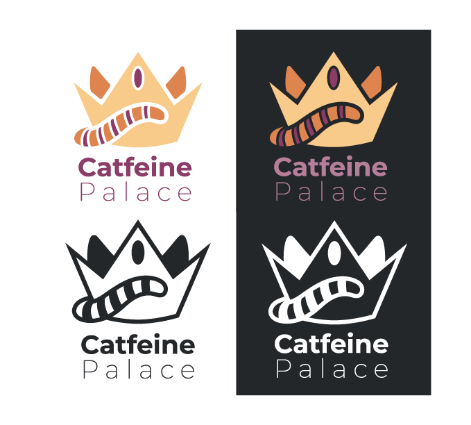
The first project we were tasked with completing upon the start of the Intro to Graphic Design course, was to create a logo for a fake business. We were limited to using only three colors, and had to design this logo based on the features of an animal of our choosing.
I chose to create my logo around a Cat-Cafe business named "Catfeine Palace". This type of business houses cats for adoption. Patrons can come inside and grab coffee while helping socialize cats so that they are ready to be placed in their forever homes.
Below is my submitted work. I provided four different versions to show the versatility of the logo for minimal color options as well as applications on light and dark backgrounds.

Magazine Design Project
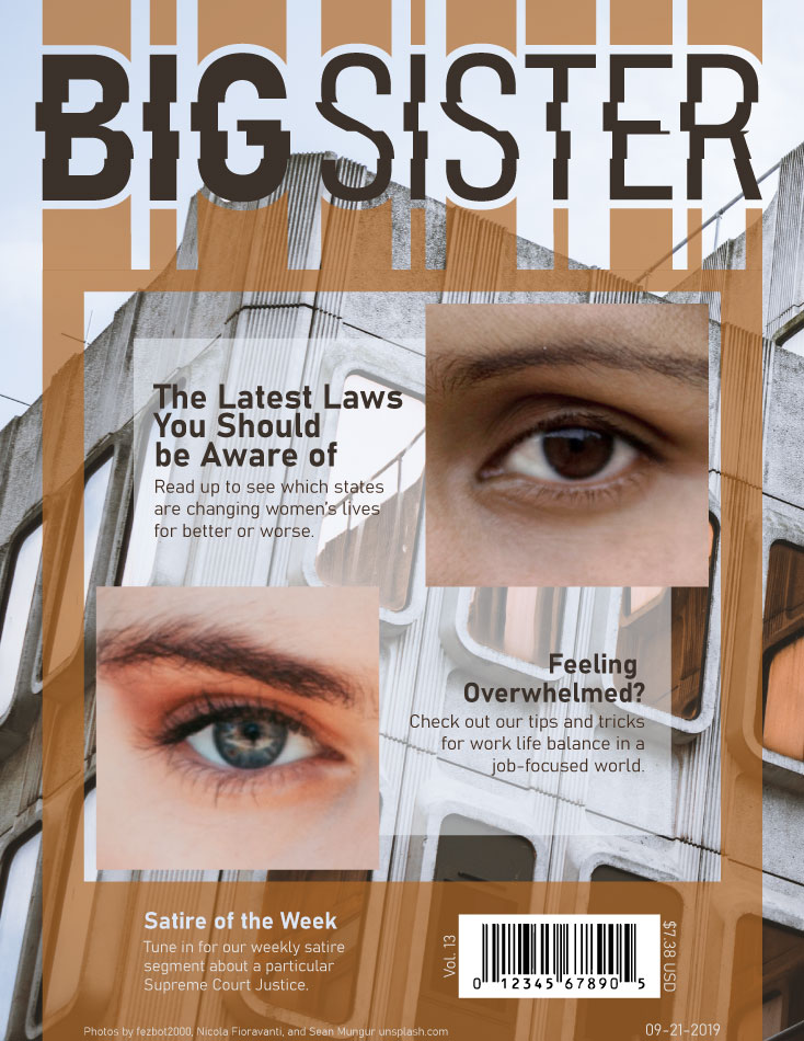
This project was actually divided into two separate projects. In the first part, we were tasked with designing a magazine cover around a concept of our choosing. We had to make sure that our designs reflected real-life covers. It had to include dates, editions, price, and the UPC-A barcode - basically it had to look shelf ready.
I chose to make my magazine primarily focus on women's issues and interests. Instead of going for a generic "femme" look, though, I wanted to make the look and feel more dystopian. I did this by naming the magazine itself "Big Sister" in reference to George Orwell's novel 1984. The images and colors I chose also reflect this aesthetic by having a more 'industrial' feel.
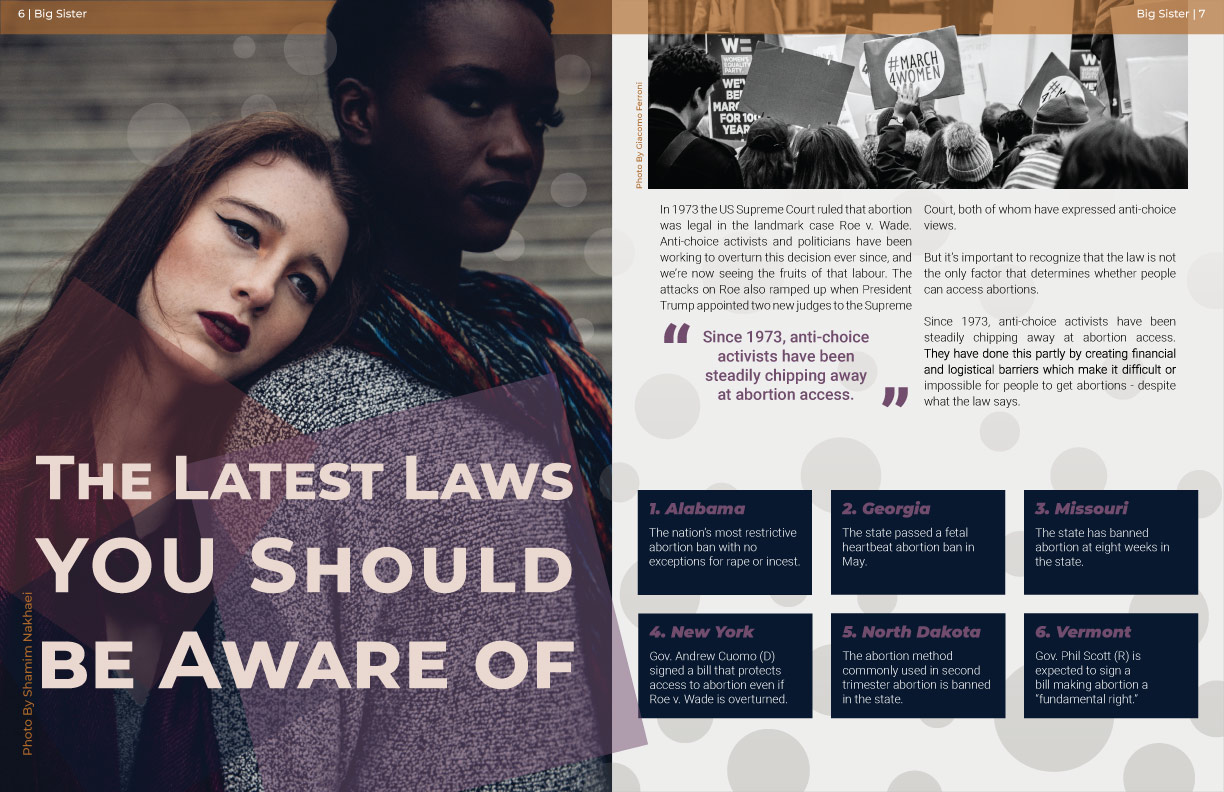
In the second part of this project, we were tasked with creating a two page spread that would match the theme of our magazine cover. As a reference to the article on the top left of the magazine cover, I designed my spread to feature a small article about Abortion rights in the US and how each state is handling them. I included an exerpt from a real article as well, to fill up the page with real text.
Below you can see both of these submissions:

